
Webflow has experienced a significant surge in popularity, becoming a dominant force in the design and development industry. It has positioned itself as a leader in the no-code tools market, reshaping the workflows of numerous designers and developers. However, one aspect that sets Webflow apart and presents a challenge is the requirement for users to have a basic understanding of how websites function. This learning curve can be a hurdle. In this article, I aim to impart the key insights and practical knowledge about Webflow that I’ve acquired and seamlessly integrated into my daily work.
What’s Webflow
If you’re unfamiliar with Webflow, it is a visual web design tool designed to transform your design choices into polished, production-ready code. It is crafted to empower not only designers and developers but essentially anyone, facilitating the creation of fully responsive websites.
The Beginning
While it may be apparent, Webflow University offers more than your typical instructional videos, which is why I’m emphasizing its importance at the outset of your journey. It’s the place where my admiration for this product blossomed. The tutorials are consistently concise, under 5 minutes, and remarkably amusing, despite delving into technical coding aspects. The educational materials cover every facet of the application, showcasing a masterful creation of resources.
The Box Model
Mastering this CSS rule poses a minor initial challenge. Essentially, it revolves around comprehending the workings of websites, where each block is defined by specific properties that dictate its placement on the site. Webflow’s design approach centers on stacking boxes atop one another, setting it apart from graphic editors like Sketch, Figma, or XD. Unlike the freedom to place elements anywhere on a canvas in graphic editors, Webflow involves the structured stacking of blocks to create the desired layout.
The Designer – Main Interface

So this is it; this is the interface where we’re going to be creating all the designs. There is obviously a lot going on, so let’s look at the most important parts for you.
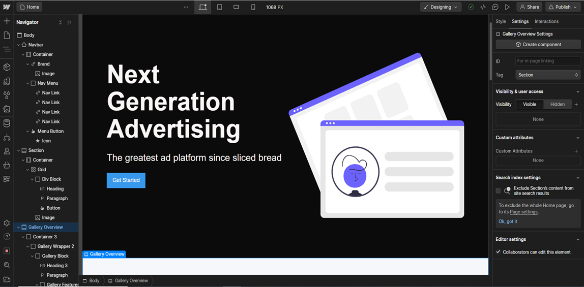
1 – Navigator: This represents the page structure, offering a comprehensive overview of all elements like divs, images, or text blocks. It can be likened to the layers in tools such as Sketch or Figma.
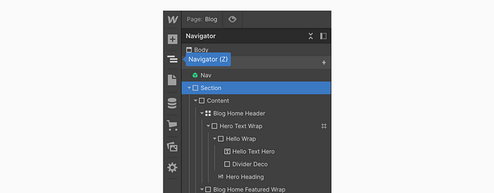
Navigator panel
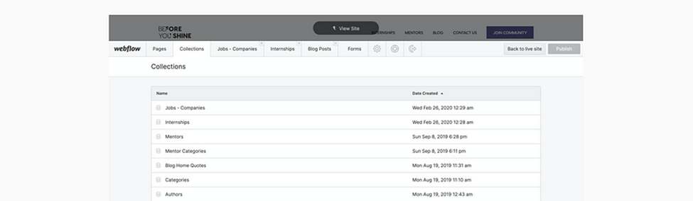
2 – Pages: Here, you’ll discover a summary of all your project’s pages, complete with details. You also have the option to duplicate existing pages or add new pages and folders to maintain a structured workflow. It’s worth noting that while folders are excellent for organization, they will incorporate “folder name/” into your URL, so it’s essential to consider this when planning your project.
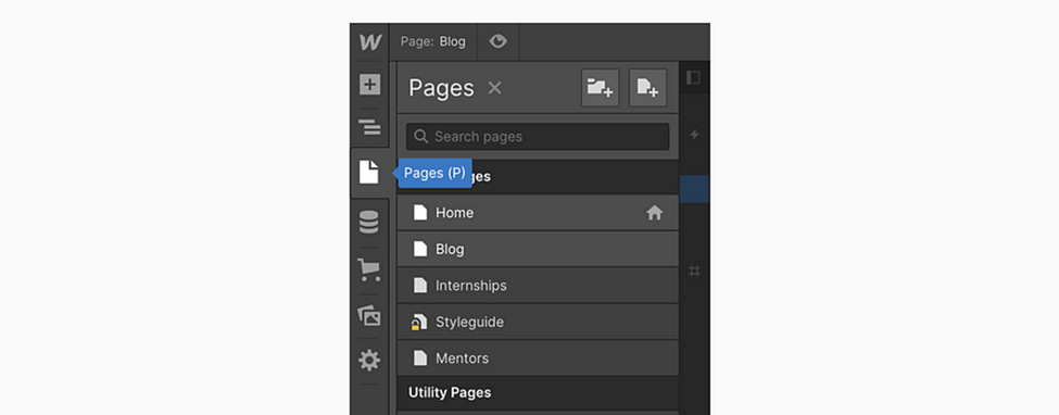
Pages Overview
3 – Page & SEO Settings: When the Pages panel is open, simply hover over a specific page and click on the settings icon to incorporate diverse SEO and OG tags. This is also the space where you can insert custom code, duplicate pages, or remove them as needed.
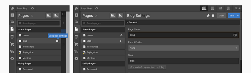
Hover over a page in the Pages panel and click on the settings to open the second panel
4 – Assets Manager: This section serves as a centralized hub for viewing all the assets utilized in your project. Through a clever workaround (explained below), it functions similarly to an FTP, allowing you to, for example, upload your OG Images.
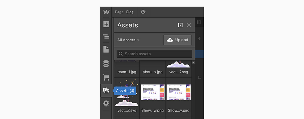
Assets panel
5 – Style Panel: The main panel is your primary workspace for manipulating elements within the project. Here, you can incorporate margins, colors, and text sizes, and ensure proper positioning in your designs. In the style panel’s initial section, there’s a designated field for the Selector, allowing you to assign CSS classes/classes to your element. This feature enables you to style multiple elements simultaneously. Additionally, the small arrow in this section is used for styling the states of your element, such as defining the appearance on hover, etc.
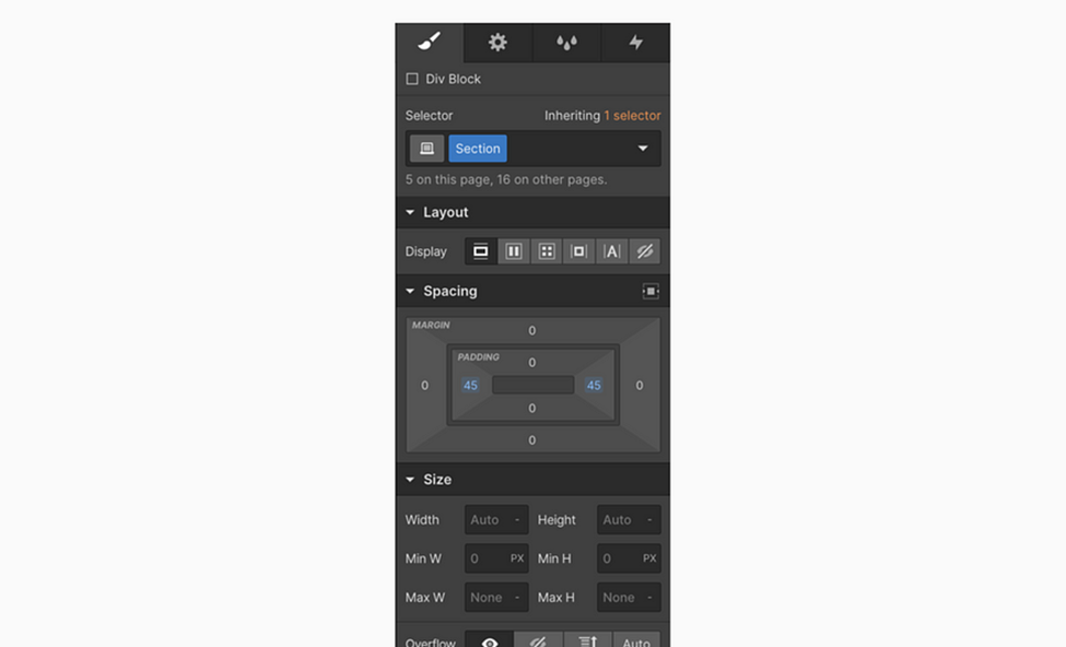
Style Panel
6 – Element Settings: The second tab in the right panel is dedicated to the individual settings of a specific element. Here, you can configure details such as the destination of a particular button link or how specific collections should filter results. It’s crucial to note that this panel is exclusively associated with one item, distinguishing it from the style panel and classes, which may impact multiple elements simultaneously.
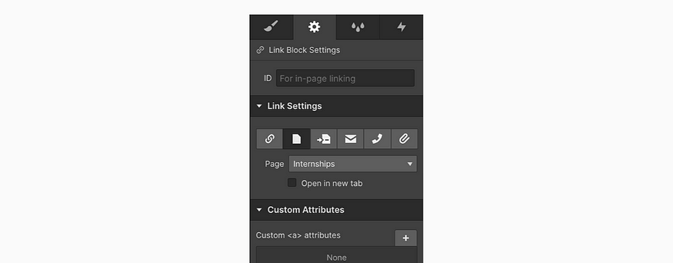
Element settings
7 – Interactions: The advanced segment of Webflow is often regarded as the essential Webflow magic, providing a platform to configure captivating animations and transitions for your project. However, for your initial projects, it’s not an immediate necessity, and we’ll set this aside for now.
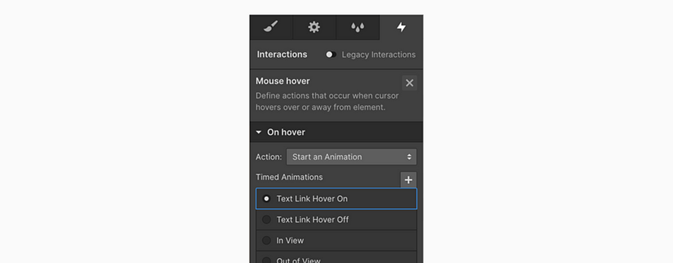
Interactions Tab
8 – Break Points: There are four primary breakpoints and a new panel displaying the current resolution. These four tabs allow you to assess how your website appears on various devices. This feature is something I would have deeply appreciated in Sketch. The true strength of Webflow becomes evident here. Remember the extensive hours spent in Sketch or Figma creating separate designs for tablets and mobiles? Adjusting text and crafting intricate designs just so your developer can understand how to scale it down. With Webflow, I typically complete the entire process of making a site responsive within 30 minutes to a maximum of 3 hours for complex projects.

Break Points — Desktop, Tablet, Mobile Landscape, Mobile Portrait
Device Check (Sizes) — One last thing — you see the right dragging thingy? That’s for you to test different devices and make sure your website does look awesome on all of them.
9 – CMS: This feature might be a bit advanced, but it’s an incredibly powerful tool that will significantly save you time, so it’s beneficial to be aware of it. Imagine the impact when Invision Craft entered the scene, but this time, it’s elevated to a whole new level. Webflow CMS is a pivotal component of your project that allows you to populate content into an element called a Collection list. Collections serve as containers for your content, enabling your CMS to efficiently manage it, and this is where the dynamic aspect of your entire Webflow project comes into play!
10 – Project Setting: While this isn’t integrated into the Designer interface, it serves as a dedicated space for all additional settings, including favicon, custom font configurations, hosting settings, and more.

Project Settings main view
11 – Editor: The final component of the entire Webflow Suite is the Editor, essentially the backstage for your website’s editors. Gone are the days when you received emails from clients or copywriters pointing out numerous typos in the design or live website along with screenshots for corrections. Editor access eliminates this hassle by allowing anyone to edit content at any time. While this may initially sound daunting, rest assured that editors have limited access, restricted to modifying content within existing elements. With editor access, you can also invite contributors to submit articles for your company site or any other content.
A separate interface is accessible via the logo in the left corner of the Designer
12 – Top Bar Actions: The third section is crucial for exporting your code to use on your hosting, offering insights into the undo and redo status when your project is saved to Webflow servers. The fourth icon facilitates sharing your project via the Designer, providing a platform for support or assistance. Finally, the fifth icon is where you’ll publish your site, making it accessible to your audience.
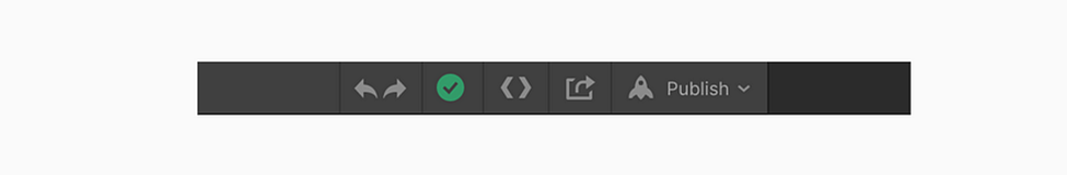
Undo Redo | Cloud Status | Code Export | Read-only link | Publishing of your project!
And that’s all about the interface. Next, we will cover all the elements like div or link block to look at to start creating!
Elements Panel
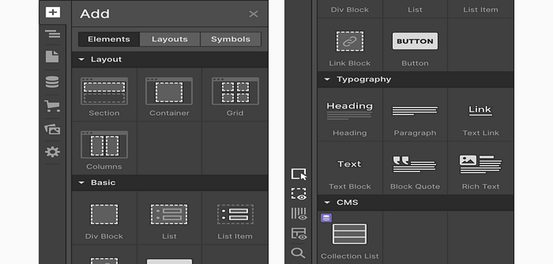
Upon launching Webflow for the first time, you’ll encounter a diverse array of elements that may initially seem overwhelming. To simplify the learning curve, some elements come with predefined properties, while others are tailored for specific use cases. Let’s focus on exploring the most commonly used elements together, delving into the basics to help you navigate through them. You can then explore the remaining elements as you progress in the process.
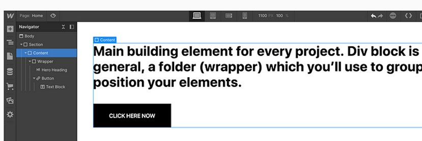
Div block: The fundamental building block for every project, the Div block, essentially functions as a folder or wrapper that you utilize to group and position your elements. When configured with Flex properties, the Div with Flex becomes an invaluable asset, often becoming your go-to tool. A typical and widely used layout structure often involves employing these elements.

Note: You might have come across elements like Sections, Containers, or Columns, which are excellent starting points. Feel free to use them, but in my perspective, they are essentially divs with predefined properties that you can’t modify. While they provide a convenient starting point, it might not be the most flexible decision in the long run.
Grid (Layout)— Div Block, Flex and Grid — The ultimate combination and, in my personal view, the most crucial building elements/properties involve the use of the Grid. Grid is an incredibly powerful element that should be a part of your skill set. Think of it as an invisible mesh that strategically organizes your content on the page and adapts seamlessly around various viewports.

Link Block (Basic)— The Link block does precisely as its name suggests — linking everything inside it to a URL, a page within a project, an email, or a phone number. Clicking it can also trigger the download of an attachment. The Link block is particularly useful for creating buttons or linking entire content blocks, similar to what’s depicted in the image.

Typography — Headings, Paragraphs, Text blocks, and Text links are fundamental building blocks in every project, each performing its designated function. However, it’s crucial to highlight the significance of the Rich Text Element. While it may be a bit more advanced, it becomes incredibly useful when constructing blogs or dynamic pages with content populated through CMS.

Form Block (Forms) — The Forms folder contains several elements, but the essential one is the Form Block. To get started, simply drag the Form Block, and if you require additional elements, you can find them within the same folder. Starting with the Form Block ensures you have the necessary foundation, and you can then add more elements as needed.

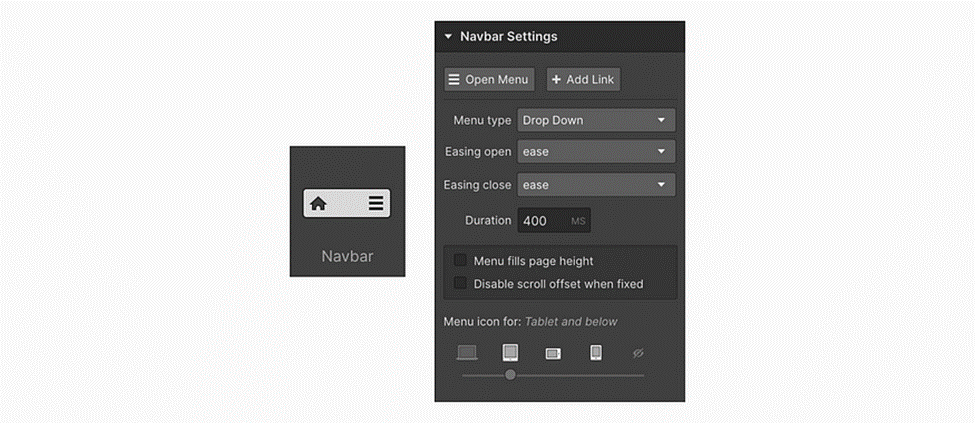
Navbar (Components)— Another integral component of any typical Webflow project is the Navbar, complete with all the necessary properties. Interestingly, for the first few months, I wasn’t even aware of the existence of this element, leading to a bit of a nightmare while customizing everything. The Navbar includes three navigation links within the Nav Menu, a folder that you can utilize on smaller devices to slide down by clicking on the menu icon.
The menu icon, initially visible by default on tablets and below, is customizable, posing a challenge for many users. The trick here is to select the icon, press delete, and then insert your custom menu icon into the Menu Button wrapper. While the Navbar comes with numerous predefined properties, it may seem a bit challenging initially, but with practice, it becomes more approachable.
Tabs (Components)— Great for stuff like pricing for monthly or yearly payments or showing different features overviews.

Lightbox (Components) — To handle showing full-size previews of your portfolio pictures or details of your e-commerce products.

Slider (Components) — And good old slider. A component that can slide from images to any div structure to be suitable for stuff like customer testimonials, etc.

Collection list (Extra — CMS)— Collections serve as a method for integrating CMS content into your websites. It comprises three wrappers, each on a distinct level. Initially, you must select the CMS collection you want to connect to start working with its individual items. This way, you style one item, and the changes are applied simultaneously to all X items. It’s akin to symbols in Sketch or components in Figma, providing consistency across multiple items.

Embed (Extra — Components) — Lastly, in the Elements panel, there’s the Embedded code element. By dragging this element, you’ll encounter a straightforward code editor where you can insert any type of custom code you’d like. This feature allows you to add code you’ve written or code you find on forums, offering flexibility for advanced customization.
